
Community Music Network
Role: UX/UI Designer, Design lead
Deliverables: Feature road map, User research analysis, High fidelity wireframes
Tools: Figma, Google Docs, Optimal Workshop
Team: Nora Lotfy, Erick lagunes, Tehila Harris
Community Music Network is a school located in the Catskill mountains that provides music lessons in person and remotely. People of all ages can attend though they focus especially with children.
Overview
The organization is looking to improve the website to increase registration for their programs and donations for support.
The Challenge
Create a more concise process way to book music lessons, with information regarding instructors.
Business Goals
Reorganize the site content into something users would find easier to engage with and aligns with the mission, programs, classes, and donation opportunities.
The Solution
Discover
When navigating the website, the first thing that comes to mind is the spacing between the text makes sentences hard to read.
Heuristic Evaluation
There is too much text causing cognitive overload for users that are viewing the website.
A lack of hierarchy across all pages underplays the importance of what they offer.
During the early phase of discovery, my team and I met with users to have them complete specific tasks on the website. These tasks were necessary to get the insight on their thought process when navigating the various paths. This investigation confirmed our assumptions about the difficulty of using the website. Some user frustrations were booking a class, sending donations, and contacting the school.
Contextual Inquiries
“So if I make a donation thats my tuition?”

“What’s a PO Box?”
“I don’t have the time for the back and forth. Besides, if I have to email I almost never get an email back”
Overwhelmingly, users expressed displeasure in the color and the font choices. The low contrast made the text difficult to read. Users didn’t trust the donation page because it was unclear what the money was supporting. Lastly, users found it difficult to sign up for classes and programs.
Market Research
Competitive Analysis
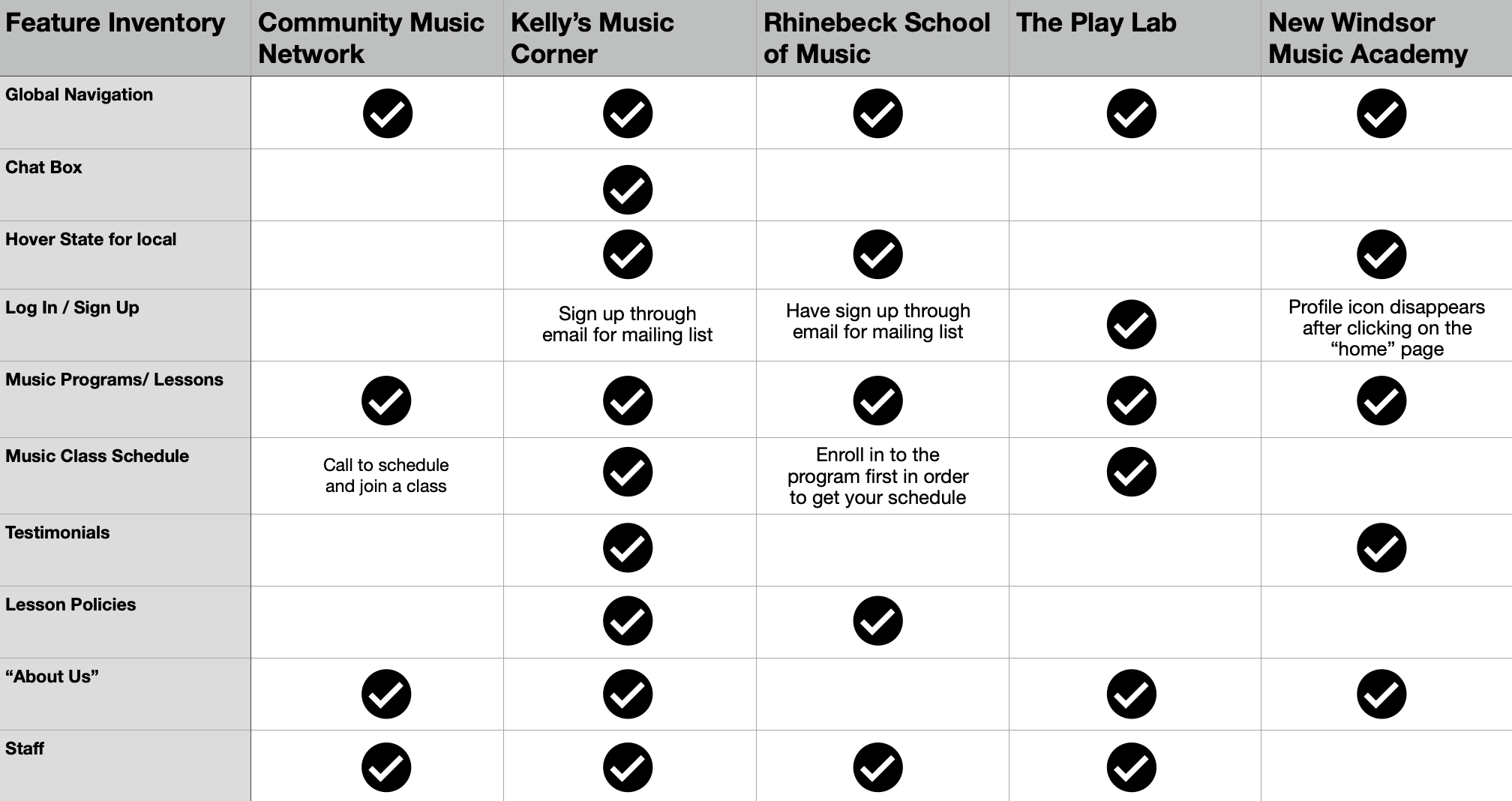
The competitive analysis was necessary in this process of research because it pointed out the key competitors and the way they structure their music school platform. These insights would give ideal structure for the Community Music Network.
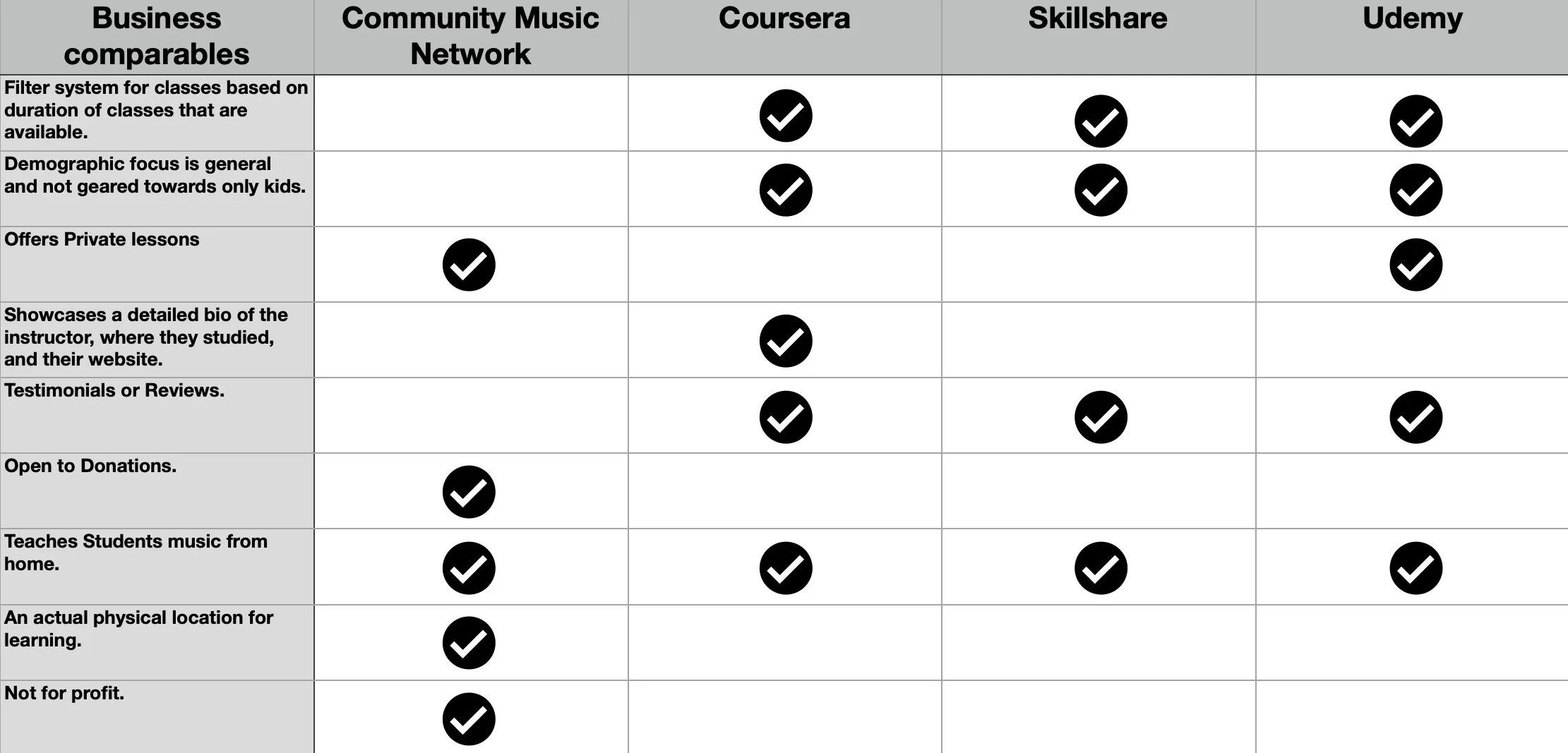
Comparative Analysis
The comparative analysis had advantages in the sense that it is comparing similar businesses that almost operate in the same industry, but may target a different demographic. These insights would provide ideas so we could learn how they format their large list of classes and how we could differentiate ourselves from the competition.
Define
During this next phase, my team and I began interviewing users to obtain ideas and trends. We constructed an affinity diagram of all the findings and separated them based on the trends that were noticed.
Affinity Map
From the Affinity Diagram there were 3 main takeaways that was notified to conclude into “How Might We” statements. These statements helped guide and refine the problem at hand.
HMW: Remove constraints getting in the way of completing task?
HMW: Make registering more engaging for our users?
HMW: Make the information clearer and comprehensible for our users?
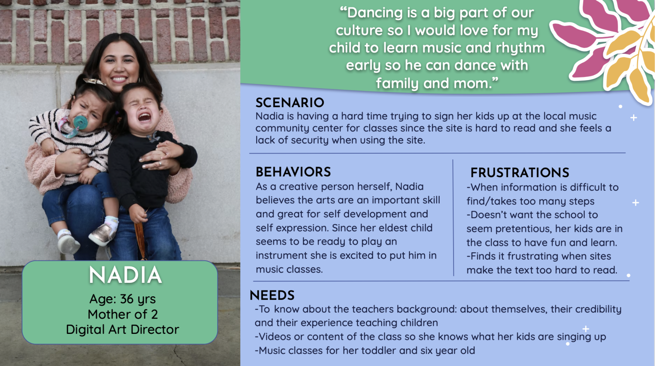
User Persona
After gathering all the insights, we were then able to produce a persona that modeled the functions of booking a class, donating, and contacting the school regarding questions.
Develop
To address the navigational issue, I was responsible for reorganizing the site content into something users would find easier to engage with. This was done with an open card sort where users matched items into categories, thus leading us to a new organizational system.
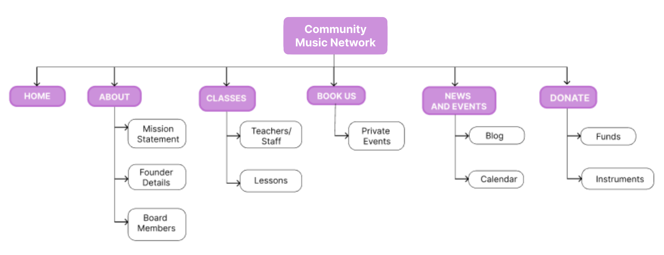
Site Map
Here, I was responsible for providing the user flow for a user attempting to book music lessons. Along with the flow for booking music lessons, I was also responsible for providing the user flow for a user attempting to make a donation.
User Flow
Using this design system we were able to implement designs in accordance of the other design ideas and iterations.
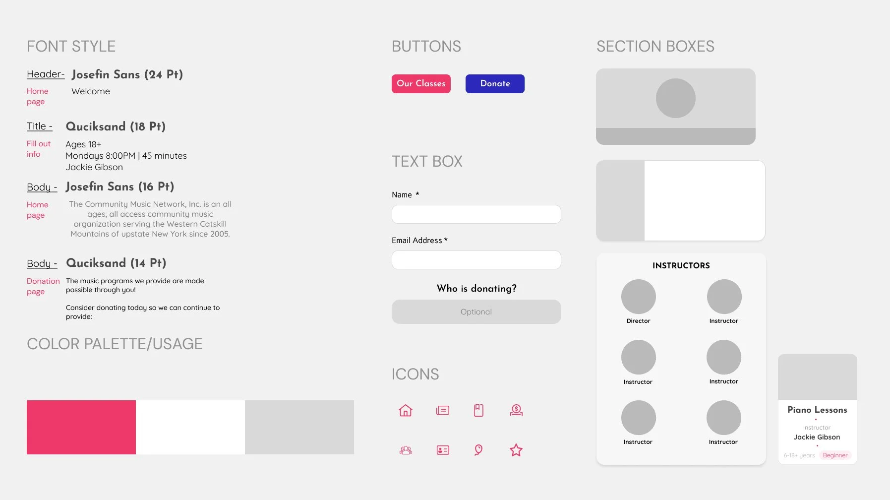
Sketching and Wireframe prototyping
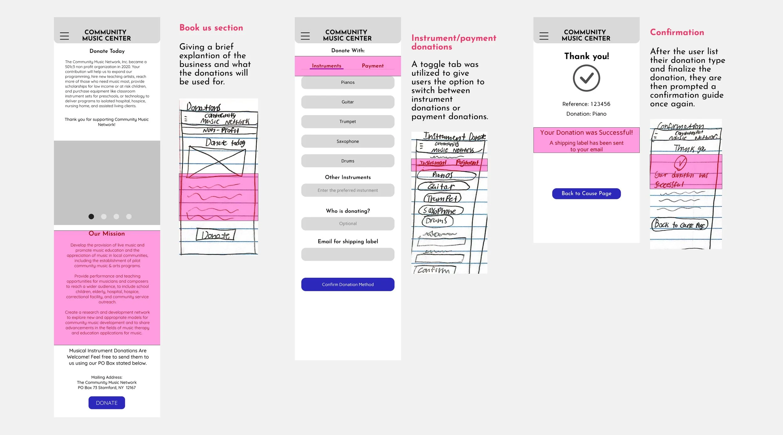
Deliverables
Moving on to the final steps, my team and I produced a prototype from the wireframes. With that prototype, we conducted tests similar to the first round of contextual inquiries.
For our Mid fidelity prototype, we wanted to ensure that all the elements were functioning properly and users could gauge the proper steps in booking a class or an event. From our test we compiled a list of data.
Mid fidelity Prototype
Users at times expected to find information about donations on the homepage
Findings:
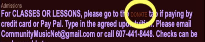
Users were overloaded with information in the donation section, which caused confusion.
The overall flow for booking a class and making a donation is generally good and makes sense
With the results of the first contextual inquiries and usability test, we can see significant improvements in the click rate and how fast users were able to navigate the website.
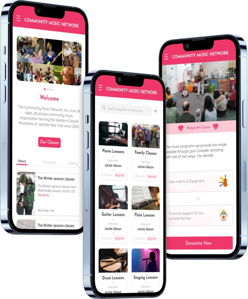
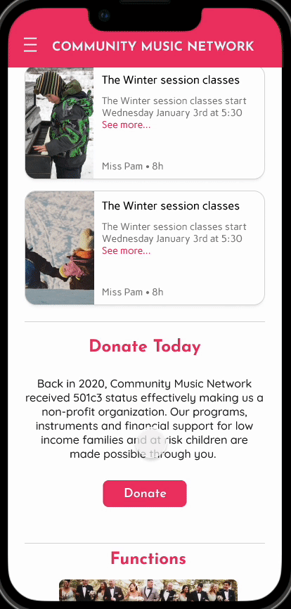
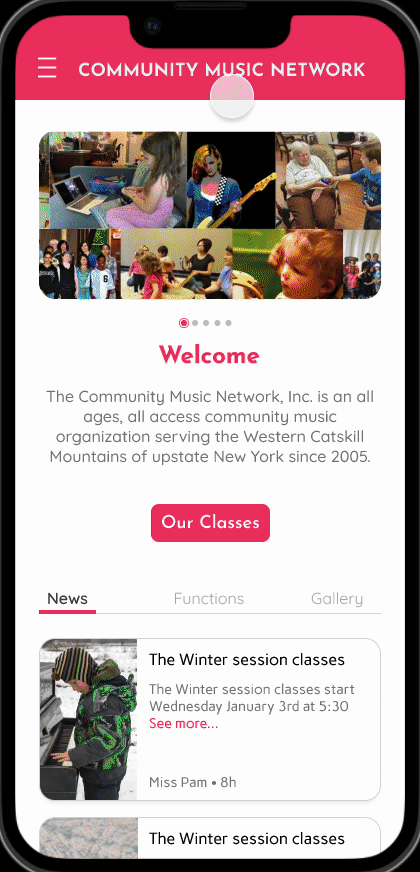
High fidelity Prototype
Average Time: Original site VS High fidelity prototype
Finding the location of the music school: 1:40 VS. .30
Book a class: 1:20 VS. 1
Make a donation: 1:10 VS. :20
Book a birthday party: 1:30 VS. :30
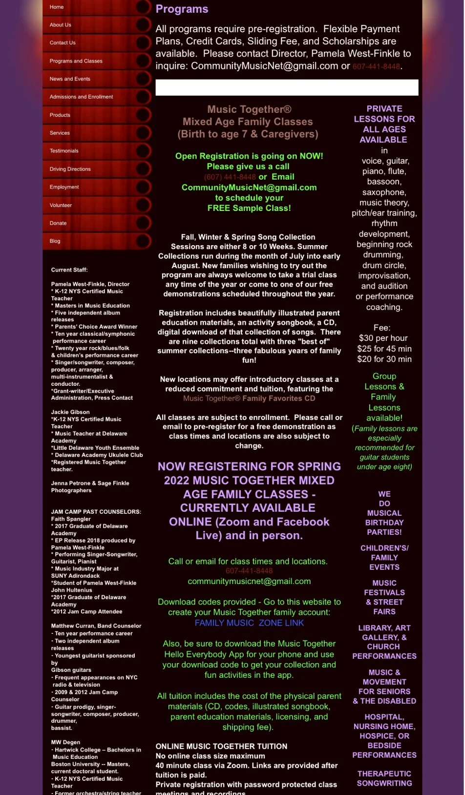
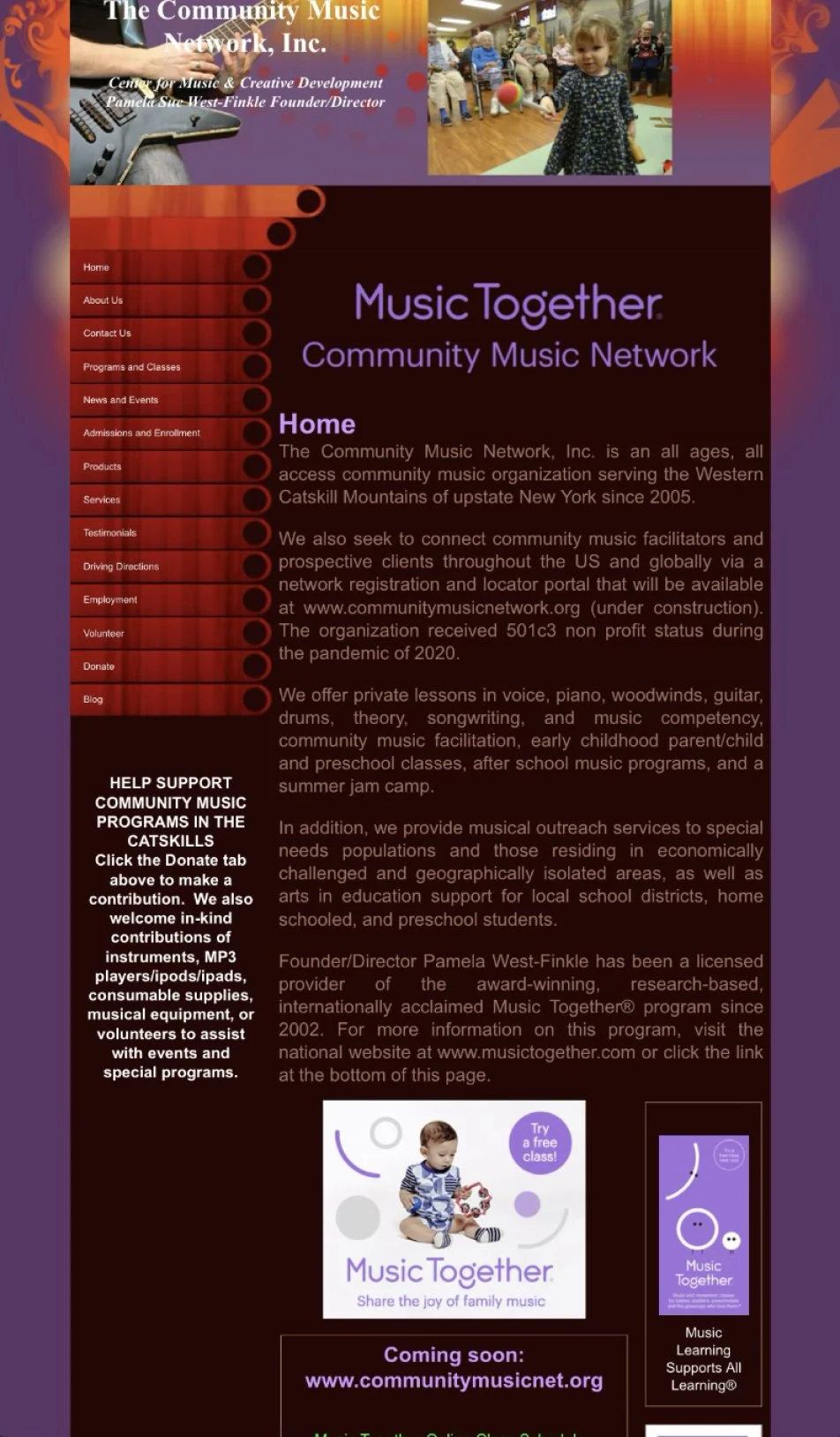
Orignal Website
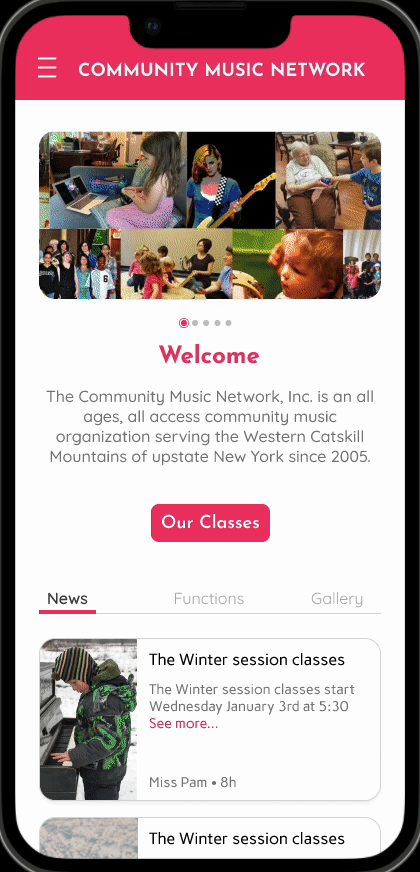
Website Redesign
Overall, I enjoyed the project and felt things were straight forward in terms of requirements and business and user goals. Some takeaways that I felt were important include; the importance of a site map in this situation due to the overlapping pages that were present. The user flow also showcased importance for this project because one of the main focus points was to encourage donations, but there was no real foundation with the donation section since it just transferred the user to PayPal.
Takeaways
further development with developers, to push designs live and test and constraints that maybe present
Next Steps
A/B testing for the donation page and its content to make sure there is a clear understanding of objectives for users.